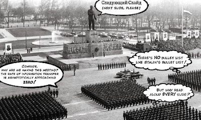
My university department has an uncompromising attitude towards Powerpoint. If you are invited to speak, to give a paper, and demand PPT, you may well be on the receiving end of a faint, resigned shrug. And perhaps a slight raising of the eyebrows. Oh yes, we'll set it up, and uncomplainingly. We'll watch the presentation. But deep down we'll know you're a lesser person for needing it.
Of course, it's a different story if your talk actually needs images: photographs of scientific apparatus, images from bestiaries, pages of secretaryhand from seventeenth-century manuscripts, and so on. In such cases, Powerpoint is clearly useful. We understand.
But if you're a philosopher—particularly a philosopher—or a historian whose paper doesn't need high-definition pictures? Well now. Why do you need it? If you can't keep the audience's attention with words, what are you doing standing up there? That is what us Luddites think. If you need a diagram, and most of us do, what's wrong with an overhead projector, a pen, and a sheet of acetate?
We are living in the dark ages. La la la.
So it's nice to know there's backup out there, underpinning our departmental culture. In the form of Edward Tufte. Tufte thinks the cognitive style of powerpoint is problematic, shading to evil! There's a Wired article from 2003 here.
From Wikipedia:
Tufte has criticized the way Microsoft PowerPoint is typically used. In his essay The cognitive style of PowerPoint, Tufte criticizes many emergent properties of the software:Which you can read here: Powerpoint and the Columbia disaster.
- Its use to guide and reassure a presenter, rather than to enlighten the audience;
- Unhelpfully simplistic tables and charts, resulting from the low resolution of computer displays;
- The outliner causing ideas to be arranged in an unnecessarily deep hierarchy, itself subverted by the need to restate the hierarchy on each slide;
- Enforcement of the audience's linear progression through that hierarchy (whereas with handouts, readers could browse and relate items at their leisure);
- Poor typography and chart layout, from presenters who are poor designers and who use poorly designed templates and default settings;
- Simplistic thinking, from ideas being squashed into bulleted lists, and stories with beginning, middle, and end being turned into a collection of disparate, loosely disguised points. This may present a kind of image of objectivity and neutrality that people associate with science, technology, and "bullet points".
Tufte's criticism of PowerPoint has extended to its use by NASA engineers in the events leading to the Columbia disaster.
I'm not saying all this to impress upon the world how endearingly sniffy about Powerpoint my department is.
But because I came across this document this morning.
WilcoxKillChain.pdf
And I could weep.
14 comments:
The terrorists have won.
That's my reaction to the Wilcox document.
Have you heard about Pecha Kucha?
Sounds like grist for a B-school/West Point+Sandhurst mashup - Kill Chain Management (shudder).
I'm a Tufte fan...
You used the picture too! You used the picture too! (and abashed I hadn't read your post already....)
That is identical to certain large corporate informational/sales materials I've read, and yes, designed. No one was kidding when they coined the term, "Military Industrial Complex."
For the record, nothing I've ever produced included the phrase, "Kill Chain Management."
I LOVE that picture!
Almost as scary when one looks ahead, are the number of high-schoolers who feel that a ppt bullet list is evidence of research, or critical thought, or anything...
I'm glad to hear about your department's attitude towards powerpoint - spot on, as far as I'm concerned.
If we are Blue, and we have a "kinematic advantage," does that mean that we move around faster or that we show better movies?
Considering how closely Hollywood is involved in military-strategic visualisation wargames, I suspect both.
Dammit! Sorry - blogger has been mangling my anchor tags beyond recognition.
Archaeologists have taken to Powerpoint like ducks to water. As a profession we are notoriously bad presenters at professional meetings and prior to PP, most papers consisted of the presenter mumbling his/her way through a series of projected photographic slides of artifacts and excavation units. PP makes it easy to do that and makes it EVEN easier to add in barely legible and incomprehensible maps, charts and lists of radiocarbon dates, pollen samples etc. Ah, progress!
You have to buy the Tufte books! All of them. Oh, and my favourite slide is on Tufte's website, about halfway down an article entitled Powerpoint and Military Intelligence.
I cant agree with this... PowerPoint is really helpful for presenters...
BTW guys, I just want to share this wonderful website that I know would be very useful for ppt-users...
http://www.free-power-point-templates.com/
The site provides free download of powerpoint presentation templates and many more PowerPoint stuffs...
Post a Comment